Why it looks this way
Every brushstroke on this site is a decision. Here is the brief we started from, the limits we worked within, and the reasoning behind each choice.
A tiny patisserie with big feelings
Sugar Bunny is a small author-run patisserie: one baker, small batches, everything made by hand. The product costs more than mass-market because time and hands go into it. Together we set three goals:
Justify the price
A guest should understand why a cake costs $18 and not $6 — before they ever see the price tag.
Stand apart from chains
Big patisserie websites are catalogues with photos and an order button. We needed the opposite of that.
Make the site a destination
The page itself should be a reason to visit — like a shop window you simply cannot walk past.
Constraints that shaped the design
No photo budget
Weekly photoshoots are impossible, so the visuals had to be timeless rather than tied to new pictures.
A tiny menu
Four items cannot be presented as a catalogue — a catalogue would look empty.
Emotional buyers
This audience buys gifts and little joys on impulse. Feelings persuade them faster than facts.
Not a website about desserts — a world you step into
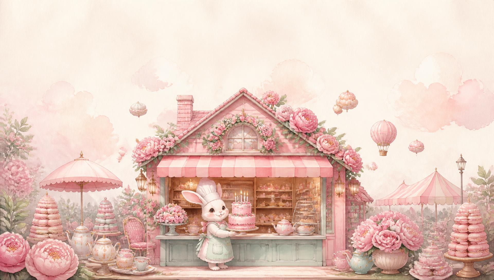
The site does not sell cake; it sells the feeling the cake promises. So the whole system is built as a sugary watercolour world of childhood — with a character, a scene and a story.
A visitor does not scroll a landing page; they peek through a bakery window. That single idea is what every smaller decision serves.
Six choices, six reasons
A mascot, not a slogan
Instead of repeating “handmade” a hundred times, Mali the bunny pastry chef shows it in a second. The brand gains a face, a name and a character — and an illustration never goes out of date the way photos do.
One living cartoon
The hero is a single moving scene — the bunny in her bakery, balloons, peonies — not a pile of separate animations. The camera zoom is almost imperceptible (70 seconds per cycle): the brain reads “alive”, but nothing distracts.
Watercolour as proof
Every icon and card is drawn with a brush, wobbly lines and all. This is not decoration: the watercolour is visual evidence for the claim “made by hand”. Stock icons would contradict the words.
Gingerbread type
The wordmark is a gingerbread cookie with icing, and the letter B has bunny ears. A thick rounded display face paired with a handwriting script makes the words themselves taste sweet.
One hero, many frames
Mali never repeats: on the banner she is inside her bakery, in the story chapter she carries out a candle cake. Like animation frames — the world stays whole instead of looking like stock images of one bunny.
A counter, not a price list
Four desserts become four little ribboned boxes with flourishes. The small menu turns into a virtue: “small batch”, “sold out means today was extra delicious”.
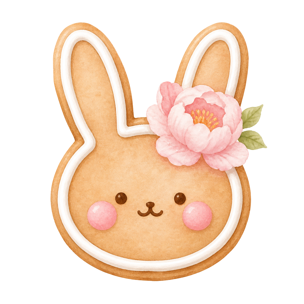
Logo — a cookie that looks like a bunny
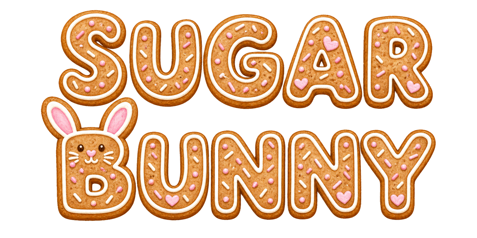
Wordmark — icing letters, B with ears
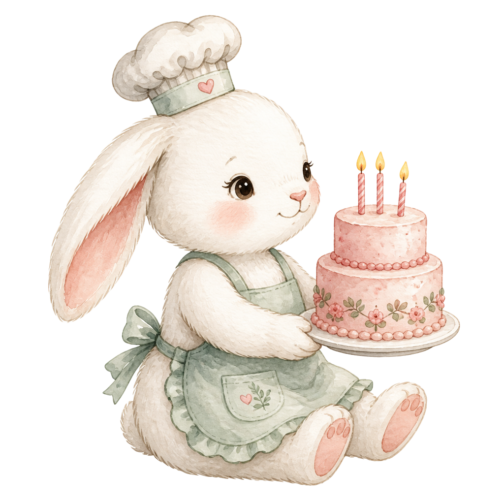
Mascot — one hero, many frames
Why this design sells
Price justified by perception
Hand-drawn illustration and animation signal “everything here is made slowly, with love” — and $18 for a cake stops looking expensive.
Word of mouth built in
People share cartoon websites. A screenshot of the banner is a ready-made social post — free distribution.
Emotional purchase
Gift buyers decide with their hearts. A world of childhood cosiness hits exactly the motive behind the purchase.
No way to get lost
Three pages instead of a complex structure — a visitor reaches the order form without ever wandering off.